How to Print ID Photos Correctly: Size, DPI, Paper, Templates, and Print Troubleshooting (2026)
Print ID photos, driving licence photos, and passport photos at the correct size and DPI. Learn sheet layouts, paper choices, printer settings, cut lines, and troubleshooting without drifting into YMYL advice.
Why ID photo printing deserves its own guide instead of hiding inside passport-print advice
A lot of websites collapse all print advice into “passport photo printing,” but the real workflow is broader. Users print passport photos, driving licence photos, national ID photos, visa-style images, and other government-issued ID outputs that still need to behave correctly on paper. The sizes may differ. The expected number of copies may differ. The sheet layout can differ. Yet the operational problem is the same: how do you turn a correctly prepared digital photo into a physical print that still measures and looks right after it leaves the printer? That is what makes ID photo printing a strong standalone non-YMYL commercial topic rather than a side note under another page.
This topic is commercially useful because the user is already near completion. They have moved beyond raw editing and now need the final physical workflow to behave predictably. That means they are thinking about printers, paper, templates, spacing, actual-size printing, and whether they can repeat the process without re-learning it every time. Good content here does not need legal or financial angles to be valuable. It only needs to explain the print system clearly enough that users can stop guessing where the next error will come from.
This guide therefore treats ID-photo printing as a measured output problem. It explains the interaction between document size, pixel size, DPI, paper, templates, printer settings, and finishing. It also explains where home printing is genuinely stronger, where retail or lab printing may be more efficient, and what buyers should compare if they want a setup that keeps working over time.
What users are actually printing when they say ID photo
The phrase ID photo is broad, which is why printing guidance has to stay practical. In some cases the user is printing a passport-style image for a national ID card. In others they are printing a driving licence photo for a workflow that still accepts user-prepared prints. Sometimes they are simply printing multiple copies of a general passport-style portrait because that is the easiest physical format available to them. The specifics can vary, but the print logic remains the same: the final paper result needs to preserve the intended size, composition, and image quality without the printer software improvising on the user’s behalf.
This is why the guide does not try to overclaim which document types always permit home printing. That would drift toward application advice. Instead, it stays focused on the non-YMYL question: once the user already has a printable image or sheet, how do they keep that output stable? That keeps the page aligned with the product and avoids making promises outside the site’s scope.
| Typical print scenario | What matters most | What usually goes wrong |
|---|---|---|
| Passport-style print | Correct physical size and clear portrait detail | Fit-to-page scaling changes the size |
| Driving licence or ID print | Keeping the document-specific layout intact | User assumes any passport-size print is interchangeable |
| Multi-copy sheet | Spacing, margins, and trim logic | Photos are placed too tightly or cut inconsistently |
| Retail photo order | Sending a ready-to-print layout instead of a vague image | Store or kiosk reinterprets the file |
Physical size, pixel size, and DPI still control the whole print result
The easiest way to think about ID-photo printing is to separate three things. Physical size is what the final trimmed photo should measure on paper. Pixel size is the amount of information the file contains. DPI is how the printer maps that information onto the paper. Users often know one of the three and then assume the others will follow automatically. That is exactly how good digital images become unreliable physical prints.
A correct crop on screen does not guarantee a correct result on paper. The print path must preserve the scale, and the printer must render enough detail cleanly. Adobe’s guidance on print dimensions and resolution is useful here because it highlights the relationship between image size and printed output. In practical terms, users do not need a lecture on graphics theory; they need to understand that once the software already exported a measured sheet, the printer should preserve that sheet instead of reinterpret it.
| Format example | 300 DPI | 600 DPI | Why it matters for printing |
|---|---|---|---|
| 2 × 2 in / 51 × 51 mm | 600 × 600 px | 1200 × 1200 px | A common U.S.-style print target that must keep its square dimensions on paper |
| 35 × 45 mm | 413 × 531 px | 827 × 1063 px | Widely used in passport and ID workflows where scale drift is easy to miss |
| 50 × 70 mm | 591 × 827 px | 1181 × 1654 px | Larger portrait format that still depends on preserving the export layout |
| 26 × 32 mm | 307 × 378 px | 614 × 756 px | Smaller card-style photo where trim and spacing become more noticeable |
The goal is not to fetishize numbers. The goal is to keep the print trustworthy. If the software exported a correct sheet and the printer prints it at actual size, the user should not have to rescue the process later with guesswork. That is the operational standard that turns a home or office print path into a dependable workflow rather than a recurring gamble.
Sheet strategy: 4x6, 5x7, A4, and Letter are different operational choices
A lot of print frustration comes from choosing a sheet size too casually. Users often think of sheet size as a minor convenience setting when it is really part of the print strategy. A 4x6 layout is often the simplest route when the user wants a compact photo print, especially if they expect to use a retail photo service or a small photo-capable printer. A4 or Letter, by contrast, give more room for multi-copy layouts, cleaner spacing, and more flexibility when the user is trimming at home. A 5x7 sheet can sit in the middle as a useful compromise when the user wants more space without moving all the way to a full office-size sheet.
What matters commercially here is that sheet choice changes the user’s next decisions. A compact 4x6 route can be easier when the user values convenience and low waste. A larger sheet can be better when the user wants many copies, more forgiving spacing, or a print station that feels more predictable once the cutter comes out. This is why content about templates, paper, and printers belongs near the ID-photo print guide. Buyers are rarely deciding on one element in isolation. They are choosing a system that will feel stable when repeated.
- 4x6: strong for simple repeated copies and compact photo print workflows.
- 5x7: useful when users want a bit more spacing without a full office sheet.
- A4 / Letter: strong when multiple copies, wider margins, or larger home-print layouts matter most.
- Template discipline: once the sheet is chosen, the layout should be preserved, not improvised inside a second tool.
Paper and media settings decide whether the print looks deliberate or cheap
Paper quality and media settings matter because document photos are small. Small prints reveal softness, weak contrast, and poor edge handling very quickly. HP, Epson, and Canon all document how strongly output depends on choosing a paper setting that matches the loaded sheet. That is not a boring printer manual detail. It is one of the main reasons a print can feel wrong even when the file itself is good.
This is why paper should be treated as part of the workflow rather than as an interchangeable consumable. Glossy, matte, and luster all affect how detail and reflections read. Thin paper can feel flimsy after trimming. The wrong media profile can muddy the print or over-saturate the result. A strong guide should therefore help the user connect paper choice to printer behavior and the expected physical feel of the final ID photo.
| Paper choice | Why users pick it | Where it can disappoint |
|---|---|---|
| Glossy | Sharp detail and familiar photo finish | Fingerprints and reflections can be more obvious |
| Matte | Lower glare and easier handling | Can feel less crisp on some printers |
| Luster / semi-gloss | Balance of clarity and lower glare | Availability varies by printer and paper range |
| Thin bargain stock | Lower cost up front | Often looks and feels weak after trimming |
Printer settings that matter most for ID photos
Most printing errors come from defaults, not from the image itself. The most important setting is actual-size printing. If the print dialog offers fit to page, scale to fit, fill page, or any similar convenience option, the safest assumption is that it will damage the document-photo layout unless you explicitly verified the result before. Those options are built for ordinary document and photo convenience, not for preserving a measured output path.
| Setting | Use this | Avoid this |
|---|---|---|
| Scale | Actual size / 100 percent | Fit to page / shrink to fit / expand to fill |
| Paper type | Correct photo media profile | Plain-paper mode when output quality matters |
| Quality | Standard-high photo quality | Draft mode for final output |
| Border behavior | Preserve the exported layout | Borderless enlargement unless you have already tested it |
Good content should also explain that preserving the software-generated sheet is often more important than “optimizing” the print dialog. If the editor already laid out the copies correctly, the printer’s job is to render that sheet faithfully, not improve it creatively. The less the print path improvises, the more dependable the final result becomes.
Home printing versus retail printing is really a control versus convenience decision
Home printing gives maximum control, but it only pays off if the user is willing to learn the media, scaling, and finishing logic. Retail or lab printing is often simpler once the final layout is already prepared, especially for users who do not want to manage trays, paper, or cutters themselves. The key commercial insight is that the same file-preparation logic can serve both routes. The difference is whether the user wants to own the final paper step or outsource it.
This means a strong ID-photo print guide should not behave like a pro-home-print manifesto. It should help the user choose the route that makes operational sense. If the user wants repeated copies and likes control, a home workflow can be excellent. If they want low effort after the layout is ready, a retail route may be smarter. Good content becomes more trustworthy when it acknowledges both outcomes instead of pretending one path is always superior.
This is another reason the topic stays non-YMYL while still holding commercial value. The page is not advising on rights or eligibility. It is helping users choose an output path and the equipment or services that support it. That is a software-and-print buying problem, not an advice liability problem.
Online print orders and printer shopping are part of the same decision
Queries like print ID photos online, ID photo printers, or passport and ID photo printer all sit in the same buying zone. The user is close to the end of the workflow and wants to know whether to keep the final step at home or hand it off to a print service. That means this page should help with the decision, not just repeat “print at 100 percent scale” and stop there.
If you already trust your home setup, a small printer-and-paper system can be worth keeping. If you do not, an online or retail print route can still work well once the layout is already correct. The useful distinction is not home versus store in the abstract. It is whether the file is ready before it leaves your hands.
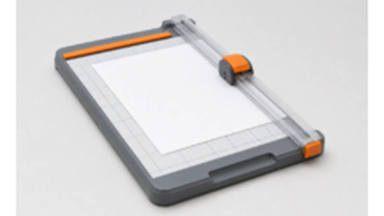
Cutting, drying, and finishing are part of the workflow, not afterthoughts
A print is not finished when it leaves the printer. The user still has to let it dry, handle it cleanly, and trim it without damaging the edges. This is where good layout spacing and cut lines become valuable. If the software already prepared the sheet well, the physical finishing step becomes much more forgiving. If the sheet is cramped, the cuts become stressful and the user can lose trust even if the image itself was fine.
This is also why a lot of users end up preferring slightly simpler print setups. Repeatability matters more than technical heroics. If the trimming step feels clear, if the paper handles well, and if the output looks stable once cut, the whole route feels usable. That is much more important than maximizing theoretical specification numbers that the user never benefits from in practice.
- Let the print dry: avoid judging the final result too quickly.
- Trim from a stable layout: good spacing reduces stress and mistakes.
- Measure one sample: do not assume the whole sheet is correct before checking one copy.
- Repeatability wins: choose the finishing path you can perform consistently, not heroically.
How to troubleshoot a weak ID photo print without changing the wrong thing first
The strongest troubleshooting habit is to change one layer at a time. If the print looks soft, start with media type and quality mode before blaming the image. If the physical size feels wrong, start with actual-size printing before editing the export again. If the tones look odd, start with paper settings and enhancement modes before rebuilding the crop. If trimming feels awkward, look at sheet spacing and cut logic before touching the printer. This order matters because a lot of wasted time comes from rebuilding the wrong stage of the workflow.
| Observed problem | Check first | Check second |
|---|---|---|
| Wrong physical size | Scale / actual-size printing | Paper size and layout |
| Soft print | Paper type and quality mode | Source image quality |
| Odd color or muddy background | Media profile and enhancement mode | Paper finish |
| Hard-to-trim sheet | Layout spacing and cut lines | Trimming method |
This troubleshooting logic is exactly what a long-form guide can do that a short page cannot. The short version can tell users what the common mistakes are. The long version can show them what to inspect first and why. That is what turns a generic guide into a genuinely valuable operational page.
A decision framework for deciding whether to keep printing ID photos at home
The final decision is not only about whether you can print an ID photo at home. It is whether you can do it reliably enough that the route feels worth keeping. If the answer is yes, then the printer, paper, settings, and finishing path have become a real asset. If the answer is no, the better route may be to keep using the software for preparation and move the final paper step to a lab or printer you trust more. That is not failure. It is simply choosing the output path that wastes the least effort.
This kind of decision framing is what keeps the content high quality and no-bullshit. It does not pretend every user should print at home forever. It helps the buyer make a grounded decision about whether the route is worth repeating. That is a much more honest commercial message than pretending the home route is always superior just because the page is about home printing.
Why this ID photo print guide deserves 5000-plus words
A shallow print page can remind users to print at 100 percent scale and choose photo paper. A real high-intent guide needs to do more than that. It needs to explain the relationship between layout and paper, between printer behavior and output confidence, between sheet choice and trimming, and between repeatability and real workflow value. Those are all practical buying and decision questions. They justify a long page because the user is trying to choose a process, not just memorize one setting.
That is what makes this kind of long-form content valuable for Passlens. It stays completely inside the product’s real strength: image preparation, print layouts, output quality, and repeatable workflows. It does not need YMYL topics to be commercially strong. It only needs to be more useful and more operationally grounded than the average surface-level print article.
How to think about buying a printer for ID-photo work without overbuying
A common mistake in home-print workflows is overbuying hardware because the user thinks “passport photo quality” must mean premium-photo-printer money. In practice, the better buying question is much simpler: does the printer behave predictably with the paper and sheet sizes you actually plan to use? If the answer is yes, the workflow can already be strong. If the answer is no, it does not matter how impressive the marketing sheet looks. Reliability beats prestige in this category because the buyer cares about repeatable outcome more than status.
This is important commercial advice precisely because it is operational, not dramatic. The best guide does not flatter the user into buying the most expensive option. It helps them recognize the minimum level of hardware stability they need: decent photo output, manageable media settings, a tray path that does not fight the paper, and a print dialog that is easy to preserve at actual size. Those are the real buying criteria. Everything else is secondary.
That also makes the guide more trustworthy. It sounds like real engineering advice rather than hardware marketing. In this category, users are often willing to spend if the reason is clear. They do not want to spend because a page told them the “best” printer is always premium. They want to spend when the equipment clearly removes friction from the workflow they are actually running.
How to build a repeatable ID-photo print station instead of a one-time experiment
The strongest home-print setups feel boring in the best possible way. The user knows which paper they use, which media setting works, which layout they trust, how the sheet behaves at 100 percent scale, and how the trimmed result should look in the hand. That kind of boring repeatability is what turns a home-print route into a real system instead of a recurring science project. A lot of home workflows feel worse than they need to because users keep changing too many variables at once and never let the system stabilize.
This is why a good print guide should encourage consistency instead of endless experimentation. If one paper works well, keep using it. If one printer path preserves the layout reliably, keep using it. If one sheet size makes trimming easier, keep using it. Repeatability matters because it reduces anxiety and turns the user’s next print into a routine rather than a fresh negotiation with the printer. That is the hidden value proposition of good print guidance.
- Keep one paper family as the standard for document-photo printing.
- Keep one known-good media setting and quality mode.
- Use the same trimming tool and finishing method whenever possible.
- Treat actual-size printing as the invariant, not as a setting to revisit each time.
When a hybrid layout-and-lab workflow is actually smarter than pure home printing
There is no shame in deciding that the smartest print workflow is hybrid. For many users, the most efficient route is to do the thinking-heavy part at home and the paper-heavy part somewhere else. They prepare the crop, background, and print layout in software, then send the final sheet to a lab or retail printer because that last paper step is not where they want to spend attention. This can still be an excellent workflow because the fragile decisions stay under the user’s control while the commodity print step is outsourced.
This matters because a lot of content accidentally becomes ideological about home printing. It implies that if you are serious, you should print everything yourself. That is not always true. The more useful question is which route gives you the highest confidence with the lowest friction. For some users, that is absolutely a home printer. For others, it is a clean export plus a trusted photo lab. Strong commercial content should help the reader decide between those routes honestly rather than pretending one path is morally superior.
Operationally, the hybrid framing is also excellent for Passlens because it keeps the content close to the product. The software still matters enormously. The output sheet still matters enormously. The only thing changing is who handles the final paper pass. That is a clean non-YMYL decision surface and a strong buying topic in its own right.
The failure patterns that waste the most paper, time, and confidence
The print failures that frustrate users most are not usually catastrophic. They are cumulative. The sheet prints slightly too large. The tones look a little muddy. The trim lines feel too tight. The paper curls more than expected. The image looked okay on screen, but the physical result feels less deliberate than it should. Individually, each problem is survivable. Together, they make the workflow feel unreliable, and that is what makes users abandon it. Strong print guidance has to be built around this reality rather than pretending the only failure that matters is a complete printer breakdown.
This is one of the reasons long-form content helps. A short guide can tell users the settings to use. A stronger guide can teach them to recognize failure patterns: what a scale error looks like, what a media mismatch feels like, how poor spacing changes trim stress, how over-processed color shows up, and when the smarter move is to stop tweaking and choose a simpler route. That kind of recognition is one of the most valuable things the content can give the user because it reduces panic and waste at the same time.
| Failure pattern | Likely cause | Most useful first response |
|---|---|---|
| Everything looks slightly “off” on paper | Media/profile mismatch or weak quality mode | Check paper type and quality before touching the image |
| Sheet feels wrong to cut | Spacing or layout is too tight | Change the sheet or layout before changing the printer |
| One print works, the next one drifts | Too many variable settings between runs | Stabilize the workflow and stop changing multiple variables at once |
| Retail print comes back differently than expected | The file was not a true ready-to-print layout | Prepare the final sheet before sending it out |
There is also a sequencing lesson here. When the print feels wrong, users often assume the image preparation itself failed. In reality, the last mile of the workflow is frequently the thing that drifted: the sheet was scaled, the media setting changed, the wrong paper was loaded, or the layout became harder to trim than expected. That is why failure-pattern recognition matters. It keeps the user from rebuilding the crop when the real issue lives in the print path.
This is commercially useful because it saves buyers from chasing the wrong upgrade. A user who understands the failure pattern may realize they do not need a more expensive printer or a new editing tool. They may only need a more stable paper choice, a more disciplined print dialog, or a cleaner sheet template. That kind of grounded troubleshooting is exactly what separates serious print content from generic printer fluff.
Why repeatability matters more than maximum theoretical print quality
One of the best truths in this entire category is that repeatability usually matters more than theoretical perfection. Users often assume the “best” print workflow is the one with the highest specifications, the most expensive printer, or the most intricate settings. In reality, the workflow that usually wins is the one the user can reproduce reliably. A slightly simpler setup that prints the same trustworthy sheet every time is more valuable than a more advanced setup that keeps surprising the user with edge cases and extra troubleshooting.
That is a genuinely commercial insight because it helps buyers spend more intelligently. It protects them from overbuying and from wasting time on complexity that does not improve the final result enough to matter. It also aligns perfectly with Passlens’ product philosophy: clear, predictable, repeatable workflows are worth more than fancy promises if the user needs a result that they can trust.
This is why a strong ID-photo print guide sounds practical rather than dramatic. It helps the user build a repeatable output system. That is ultimately what they are paying attention to, even if they initially searched with a simpler phrase like “print id photo.”
Why measuring the finished print is still the simplest high-signal quality check
The single most underrated habit in ID-photo printing is measuring the finished print instead of trusting how it feels by eye. This is not because users are incapable of judging size visually. It is because small drift is very hard to see once the photo is cut and sitting on a desk. A sheet can look proportionate and still be physically off enough to undermine confidence. That is why a ruler is one of the most valuable tools in the workflow. It turns a vague feeling into a clear answer: is the print the size it was supposed to be or not?
This also reinforces the logic of the whole print pipeline. If the size is wrong on paper, the user knows to inspect scale and layout behavior before touching the image again. If the size is right but the print still feels weak, the next place to look is media handling, quality mode, or the source image. Measuring finished output gives the user a stable troubleshooting anchor. Without that anchor, it is easy to start changing random settings and lose confidence quickly.
Commercially, this matters because the best print workflows do not just create output. They create clarity. A workflow that encourages measurement and gives the user the information needed to act on that measurement is a much stronger product experience than one that leaves the user guessing. That is a real quality differentiator in the home-print and template market, and it deserves to be treated as such in long-form content.
Choosing a long-term print strategy instead of solving the task from scratch every time
Users often approach document-photo printing as if every print is an isolated project. That is understandable, but it is inefficient. The strongest setups are the ones that become stable over time. Once the user knows which paper works, which print dialog settings preserve scale, which sheet format trims cleanly, and which output layout they trust, the task becomes much lighter. They are no longer figuring out printing from zero. They are reusing a proven path.
This is why long-form content about printing can support genuinely high-intent traffic. It helps readers move from “how do I do this once?” to “how do I build a workflow I will not hate next time?” That is a much more commercially meaningful question. It influences which printer they keep, which paper they buy again, which software layout they trust, and whether they choose to print at home or continue sending files to an outside service. The guide is useful because it helps the user make a stable decision, not just a one-time rescue.
For Passlens, that is exactly the right kind of content expansion: practical, product-adjacent, repeatable, and non-YMYL. It keeps the site anchored in image preparation and output quality while still giving users something strong enough to justify high-intent search traffic. That combination is much harder to achieve with shallow printer tips or boilerplate print instructions alone.
Why a ready-to-print sheet is usually better than sending a single image and hoping the printer guesses right
One of the highest-signal distinctions in ID-photo printing is whether the user is sending a single portrait file or a true ready-to-print sheet. A single image sounds simpler, but it often pushes the hardest decisions into the printer dialog, the kiosk software, or the retail operator. That is risky because those tools are built to make ordinary photo printing convenient, not to preserve a measured document-photo workflow. A ready sheet, by contrast, locks more of the intended behavior in place before the file reaches the printer.
This difference matters at home and outside the home. On a home printer, a ready sheet reduces the temptation to improvise with scaling, margins, and manual duplication. At a retail counter, it reduces the chance that someone else will reframe the task as “print this nice photo somewhere on the page.” The more the layout is decided upstream, the less the downstream tools are asked to guess. That is good engineering and good buyer guidance.
This also explains why template-driven content has real commercial value. Users are not only asking for a print. They are asking for a print that remains stable across different devices and environments. A strong ready-sheet workflow answers that need much more clearly than a loose single-image export does. It is one of the cleanest ways to improve the print experience without pushing the user toward more expensive or more complicated equipment.
Why a printer-preview window is not proof that the final sheet will be correct
A lot of users put too much trust in the printer-preview window because it looks authoritative. It shows the sheet, the margins, and the page orientation, so it feels like a final answer. But print previews are still only previews of a chosen settings stack. If the wrong scale option is active, if the border behavior is off, or if the paper size has been guessed incorrectly, the preview can still look plausible while the physical result is wrong. That is why print guidance has to keep reminding users that visual reassurance inside the dialog is not the same as a measured output on paper.
This is another reason repeatability matters so much. Once the user finds a settings combination that preserves the sheet correctly, the best practice is to reuse that combination rather than re-negotiate the preview every time. A stable preview stack is useful. A constantly changing preview is not. Good content should teach the user to see the preview as one checkpoint in a system, not as a magic guarantee that the system is already correct.
That framing keeps the page practical and no-bullshit. It does not ask the user to distrust the printer completely. It simply tells them not to treat the preview as the final authority. The final authority is still the printed sheet in the hand, measured and checked against the intended dimensions.
A final operator note for buyers who care more about reliability than novelty
If there is one theme that runs through this whole guide, it is reliability over novelty. The best ID-photo print workflow is not the one with the flashiest printer, the most experimental paper, or the most dramatic settings menu. It is the one that behaves predictably enough that the user would trust it again tomorrow. That is the standard worth buying toward.
A repeatable sheet is worth more than a clever one-off print.
That is the simplest benchmark for a serious print setup.
If it repeats cleanly, it is probably the right workflow.
And if it still feels uncertain, the smartest next step is simplification, not more random experimentation.
Stable output beats clever output every time.
That is the practical standard.
Representative sources and related guides
- HP Support - Print photos with an HP printer
- Epson Support - Paper type settings and media options
- Canon Manual - Printing photos
- Adobe Help - Change print dimensions and resolution
- U.S. Department of State - Passport photos
- GOV.UK - Photos for passports
- Passlens - Passport photo printer guide
- Passlens - Passport photo paper guide
- Passlens - Passport photo template guide
- Passlens - Collage photo maker for print layouts
- Passlens - ID photo print guide