Best Passport Photo App? iPhone, Android, Browser, and No-Download Web App Workflows (2026)
Looking for the best passport photo app for iPhone, Android, or the web? Compare free apps, no-subscription browser tools, 2x2 and 600x600 exports, 4x6 retail print sheets, privacy, and no-watermark workflows.
What people usually mean by passport photo app
Most searches for passport photo app do not really mean show me an icon in an app store and I am done. They usually mean I need a tool that helps me turn an ordinary portrait into a passport-size or ID-style result without losing confidence halfway through the process. That is an important distinction because the user is not shopping for entertainment software. They are shopping for workflow confidence. They want to know whether the app can help them capture the image, set the crop, handle the background, and then give them a final file or print output that feels trustworthy enough to stop searching.
That is why a useful passport-photo-app guide has to talk about the whole job instead of stopping at the install button. The practical question is simple: can this route take you from a normal phone photo to a digital file or print sheet without making the final step confusing? A good answer compares capture, crop review, background cleanup, privacy, export, and printing in one place.
A lot of weak content still treats this as a shallow best apps roundup. That is not useful enough. The better approach is to treat passport photo apps as one branch of a broader software category. Some users genuinely want a phone-first workflow. Some want a browser workflow but start their search with the word app anyway. Some want a hybrid path: capture on the phone, finish in the browser, and print somewhere else. Good content has to respect those realities rather than force every user into one software story.
The same thing happens with searches like biometric photo app. In practice, many people use that phrase when they want a phone-friendly route into a passport, visa, or ID photo workflow. They are not necessarily demanding a native install. They are trying to get from phone camera to final file with as little friction as possible.
If you do not actually want an app-store download, skip that detour and open the passport photo maker without uploading by default, the US passport photo maker, or the 600x600 passport photo maker. Many passport-photo-app searches are really asking for that browser route.
Best passport photo app for iPhone and Android: quick answer
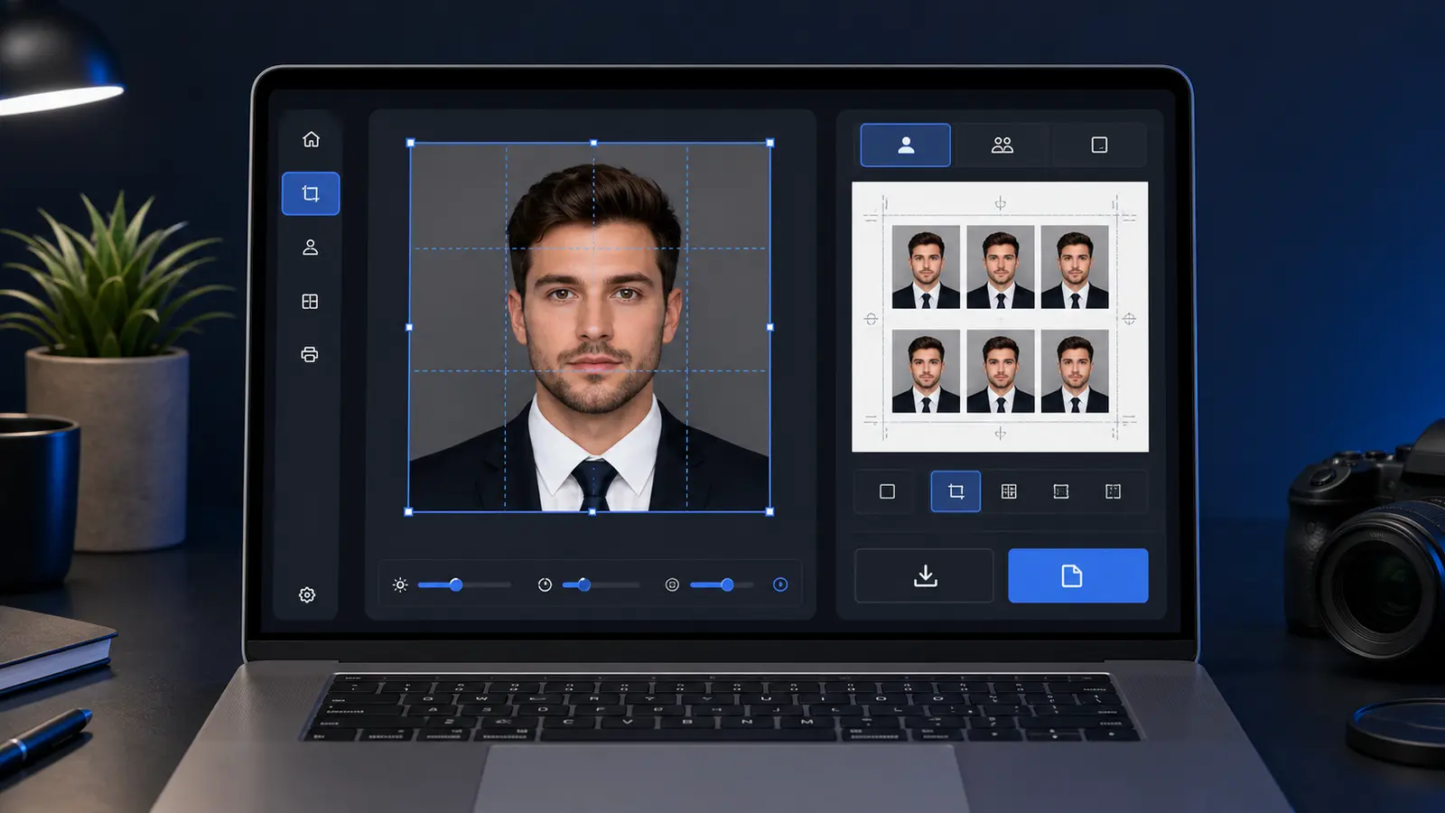
The best passport photo app is not always the app-store download with the loudest screenshots. For many people, the better route is a no-download passport photo app: use the phone camera, open a browser tool, choose the exact passport, visa, or ID preset, and export the file or sheet without installing another app first.
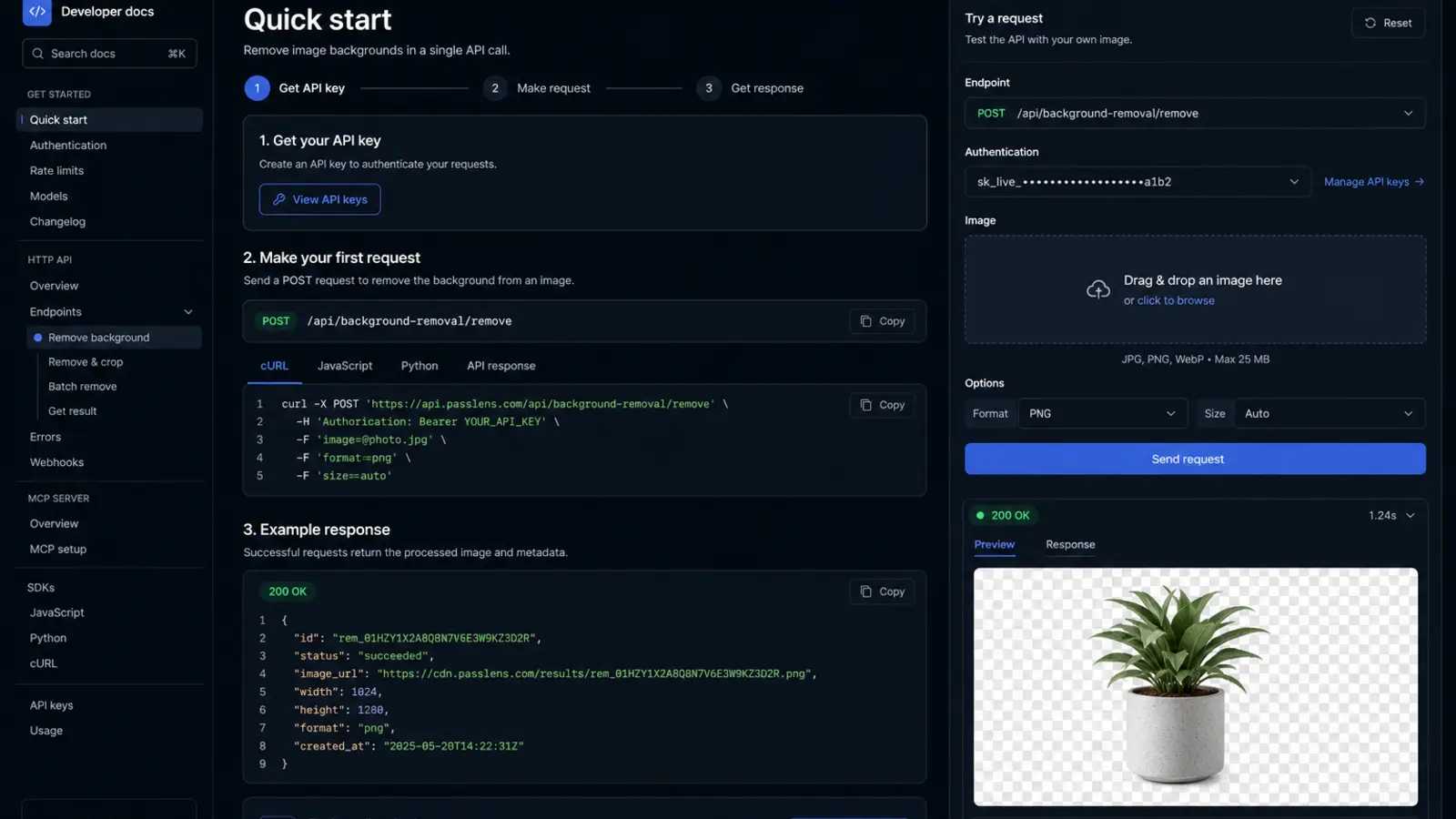
Capture on your phone, finish in the browser is often the cleanest workflow. The phone is good for taking the portrait. The browser is better for checking crop, reading rules, preparing a 4x6 print sheet, and downloading a measured output. Passlens is built for that path: No signup, no watermark, browser-first editing, and 300/600 DPI exports for users who need the final file to be predictable.
That does not make native apps useless. App Store and Google Play passport-photo apps can be convenient when the whole job stays on one phone. The tradeoff is that users should compare the full workflow instead of judging the first tap alone: capture, crop review, background cleanup, digital file export, print layout, privacy, and whether the result can be revisited later.
If your real job is a U.S. passport file, use the US passport photo maker. If the site you are submitting to wants a square digital upload, use the 600x600 passport photo maker. If you already have the photo and only need a final review before export or print, use the passport photo checker.
- Choose a native app when you want everything inside one iPhone or Android flow and the app explains its export clearly.
- Choose a browser app when you want no install, easier review, print-sheet control, and a clearer privacy explanation.
- Choose a hybrid workflow when you want the fastest capture plus a calmer final review before download or print.
How to choose between a phone app, browser app, and hybrid workflow
When someone searches for a passport photo app, they are usually ready to finish the task. The choice is not abstract. They need to know whether a native app, a browser app, or a hybrid phone-to-browser workflow will get them to the right file or print layout with the least friction. This guide treats the decision that way instead of ranking apps from screenshots alone.
The decision also connects to the next practical step. A user who starts with an app question may quickly need a crop tool, a background cleanup route, a 4x6 print sheet, an A4 or Letter layout, or a printer guide. Those are not separate problems from the user’s point of view. They are the same job moving from capture to final output.
Best framing
Treat a passport photo app search as a workflow choice rather than a mobile-app choice.
App-store searches that usually mean one of three jobs
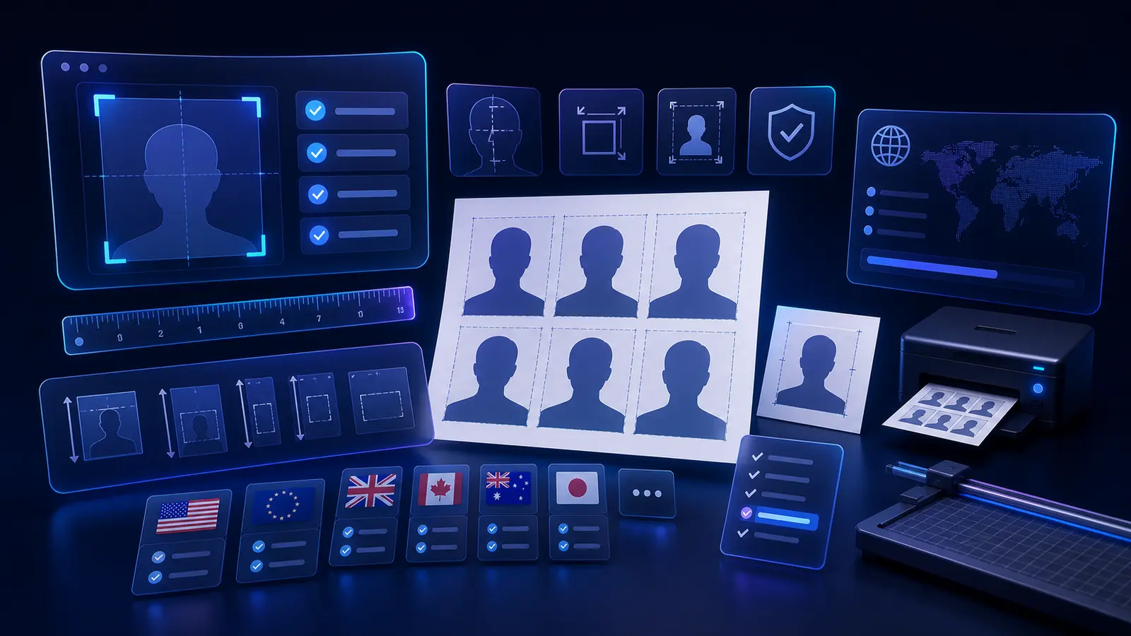
Searches like passport photo app free, passport photo app no subscription, and passport photo app no watermark usually come from people who are tired of locked downloads. The first screen can be free while the usable file is still locked, retouched, or watermarked. The real question is whether the final file is usable after crop, background review, and export.
For U.S. users, two searches deserve their own answer: 2x2 passport photo app and 600x600 passport photo app. A printed U.S. passport photo is a 2 x 2 inch photo, while many digital workflows are easier to reason about in pixels. Use the 2x2 passport photo workflow when you need the square crop path, and check the passport photo pixel guide before a portal cares about pixel dimensions.
If you are starting from an iPhone photo, the app choice should also handle HEIC and JPEG without making you troubleshoot file formats. The HEIC to JPEG guide is useful when an upload page rejects the original phone file. For a U.S. passport path, you can start directly in Passlens with the U.S. preset and keep the phone capture plus browser review workflow intact.
U.S. passport app safety checks before you trust the export
U.S. passport-photo app searches now need one extra caution: the State Department tells applicants not to change passport photos with computer software, phone apps, filters, or artificial intelligence. That does not mean every browser crop tool is unsafe. It means the workflow should avoid changing your appearance and should make the export path clear enough that you know what happened to the file.
- Do not use beauty filters for a passport, visa, green-card, or USCIS-style photo.
- Do not use AI face alteration, skin smoothing, face slimming, eye brightening, or automatic retouching on the person.
- Do use plain review tools that help with size, crop, background checks, file format, and print layout without changing facial appearance.
This is where “free” can be misleading. A free preview with a paid, retouched, or watermarked download is still friction. A plain browser route with no signup, no subscription, and no watermark is easier to judge because the user can inspect the output before deciding whether it is ready for upload or print.
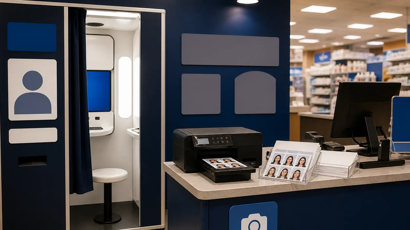
How a passport photo app should hand off to CVS, Walgreens, or Walmart
Many U.S. users do not need a store employee to take the photo. They need a correctly sized sheet that can be ordered as a normal 4x6 print. That is why app-store listings often talk about the CVS app, Walgreens app, and Walmart app: the real job is to create a print sheet, upload it as a standard photo print, and avoid re-scaling before pickup.
A good handoff makes the file and the next step obvious. If you need retail pickup, create a 4x6 sheet, keep it at full size, and order it as a normal photo print rather than a staffed passport-photo service. The 4x6 passport photo template guide explains the sheet logic, while the cheapest places to print passport photos guide compares the retail route in more detail.
That retail handoff is also a reason to prefer a workflow that gives both a digital file and a sheet. The user may need a 600x600-style upload today and a 4x6 pickup tomorrow. A tool that keeps both paths understandable will convert more app-search users into finished users.
Phone app versus browser tool is really a workflow decision
The easiest mistake users make is turning this into a device loyalty question. They ask whether iPhone or Android apps are better, or whether a web app is automatically weaker because it lives in the browser. In practice, the strongest workflow is often the one that uses each environment for what it is best at. Phones are excellent for capture. Browsers are excellent for review. Desktop and larger-screen environments are excellent for print layouts, templates, and careful inspection. Once the problem is framed this way, the product decision becomes clearer and less emotional.
| Workflow need | Phone-app strength | Browser-tool strength |
|---|---|---|
| Fast capture and retakes | Very strong because the camera is already in hand | Usually secondary |
| Detailed crop review | Possible, but the screen can feel cramped | Much easier to inspect on a larger display |
| Background edge inspection | Can be rushed on a small screen | Usually calmer and clearer |
| Print preparation | Often awkward if the whole job stays mobile | Better when templates, paper, and printer settings matter |
| Privacy explanation and output clarity | Can feel hidden behind app flows | Usually easier to present transparently in-browser |
This is why many careful users end up preferring a hybrid setup: capture on the phone, review and export in the browser. That is not a compromise. It is often the most sensible use of the tools they already have.
iPhone versus Android is mostly about ecosystem friction, not output philosophy
There are still some practical differences between iPhone and Android workflows, but they matter less than many users expect. The biggest differences usually sit around capture defaults, file formats, share behavior, and how easy it feels to move from the phone into a browser or print path. Apple, for example, documents how modern iPhones can capture in HEIF or JPEG depending on settings and compatibility choices. That matters operationally because the user may not even realize which format they are handing to the editor. Android devices vary more by manufacturer, but the same underlying principle applies: the photo app needs to absorb file-format and transfer friction gracefully, not make the user debug it manually.
For most users, the practical buying question is not which phone platform is the right one for passport photos. It is whether the tool they are using accepts their real phone output cleanly and lets them finish the workflow without confusion. A browser-first product can often neutralize a lot of phone-specific friction because it gives the user a stable review environment after capture. A phone-native product can still be strong if it handles the entire path clearly, but it needs to do more than simply access the camera quickly.
This is another reason the content should avoid app-store hype. The user does not need a fandom argument. They need an explanation of where platform differences actually matter and where they do not. In this category, output confidence matters much more than platform identity.
Capture quality still matters even when the app promises to fix everything later
No passport photo app becomes serious by pretending source quality is irrelevant. A strong app can help with cropping, review, and background cleanup, but it still works best with a clean source portrait: steady device, even light, enough headroom for cropping, and no obvious blur. The user does not need a studio, but they do need to avoid sabotaging the workflow before the app even begins.
This point matters because weak apps tend to overpromise here. They imply that a low-quality source is fine because the app will fix everything later. Better tools explain what they can improve and what still benefits from a clean original. That honesty makes the app easier to trust because it sounds like a serious tool rather than a gimmick.
- Good source baseline: steady phone, even front lighting, clean facial detail, and enough framing room.
- Good app behavior: preserve detail, keep review legible, and avoid forcing the user into blind trust.
- Bad app behavior: overpromise on weak sources and rush the user into download without inspection.
Crop and framing are where app quality becomes obvious
The crop step is where many buyers decide whether an app feels serious. A weak crop tool is just a decorative frame with a few handles. A strong one helps the user understand whether the face sits well in the frame, whether the composition feels stable, and whether the final output will still look right when printed or exported. That difference is subtle, but it is one of the strongest product-quality signals in the whole category.
This is also where app-first and browser-first experiences diverge most sharply. Small screens are good for capture and quick edits, but they are not always good for subtle review. If the app does not offset that limitation with strong, clear framing tools, the user can end up trusting a crop they never really inspected properly. That is why many users eventually prefer to move the image into a browser or larger screen before the final export.
A good passport photo app guide should do more than say whether the app can crop. It should explain how to judge whether the crop step feels trustworthy. That is the difference between a feature list and useful buying guidance.
Background cleanup is valuable, but only if the review is honest
Background cleanup is one of the easiest app features to sell because the before-and-after images are visually dramatic. But for serious buyers, the real question is not whether the background disappears. It is whether the final result still looks credible around the hairline, ears, shoulders, and collar edges. A phone app that produces flashy previews but weak edge quality will feel good for five seconds and untrustworthy for the rest of the workflow.
That is why review environment matters again here. Apps that combine background removal with good inspection tools are much stronger than apps that simply show an instant transformation and push the user toward export. Buyers want software that helps them trust the result, not merely admire the effect.
This is also where the relationship between the app guide and the broader software cluster matters. Background cleanup is not the whole product. It is one stage in the workflow. Strong content should keep it inside that broader context instead of treating it as the only reason to choose a passport photo app.
Digital output, print output, and why app workflows often weaken at the final step
A lot of apps look good until the user tries to leave them. That is because output is where software has to stop being stylish and start being operational. If the app only gives one flattened image with weak control over print or digital intent, the user still has to solve the second half of the job elsewhere. That is a major reason browser-based or hybrid workflows keep winning among more careful users. The export path feels clearer.
This is why a serious passport photo app guide should ask a blunt question: after you finish editing, does the app make the next action obvious? If the answer is upload, the file should feel predictable. If the answer is print, the layout path should be just as clear. If the app makes the user guess or re-enter the workflow in another tool, then it is not really finishing the job.
| Output situation | What the app should make clear | Why it matters |
|---|---|---|
| Single digital file | What exactly the user is downloading and how final it is | Prevents confusion and unnecessary second-tool editing |
| Print-ready sheet | How the layout is meant to be printed | Keeps the final result predictable at the physical stage |
| Hybrid workflow | How the app hands off to the next environment | Reduces friction when the user captures on phone and finishes elsewhere |
Permissions, trust, and why app access matters to buyers
A passport photo app search is also a trust question. The user is comparing features, but they are also deciding which product they trust with a face image and a document-style workflow. App permissions are part of that story. Camera access, photo-library access, export handling, and later processing decisions all shape whether the product feels respectful or opportunistic. A lot of buyers do not explain this concern directly, but it shows up in their behavior: they hesitate before installing, they read privacy notes more carefully than usual, and they compare browser-based alternatives if the app feels too opaque.
That is why a strong app guide should talk about permissions and processing boundaries as product quality issues rather than treating them like boring policy footnotes. The user wants to understand what the app needs, what happens after capture, and whether they can finish the workflow without feeling trapped inside an opaque system. In a category built around document preparation, that clarity matters.
This is not legal advice about privacy policies. It is practical software guidance: understand what the tool asks for, what it does with the image, and whether the output path is clear enough to trust.
Why app-store convenience and browser convenience are priced differently in user effort
A useful way to compare passport photo apps is to stop thinking about price first and start thinking about effort economics. App-store products often feel cheaper in effort at the beginning because installation and camera access make capture quick. Browser workflows often feel cheaper in effort later because they make crop review, print preparation, and cross-device finishing easier. That tradeoff is not obvious when users first search for an app, but it becomes very obvious once they have to leave the first capture screen and actually finish the task.
Many users will tolerate a slightly slower start if the total effort over the whole workflow is lower. Convenience should be measured end to end, not at the first tap. A passport photo app that captures quickly but creates uncertainty around export may cost more user effort than a browser workflow that takes ten seconds longer to start but makes the final review calmer.
This is also why hybrid workflows keep appearing in serious use. Capture is fast, review is clear, and output is less brittle. A guide that explains this honestly is more useful than one that forces every user into a pure app story.
Where passport photo apps usually weaken when printing enters the picture
Many mobile-first apps feel persuasive until the user needs to print. That is where the workflow often becomes awkward. The user may have a file, but not a clear print sheet. They may have a crop, but not a layout that fits 4x6, A4, or Letter confidently. They may have a save button, but not enough guidance about actual-size printing or whether the destination is a home printer, a photo lab, or a kiosk. In other words, the app solved the phone part of the problem and then left the physical-output part underdefined.
That does not make apps bad. It means buyers need to decide whether their workflow ends at a digital file or continues into a print path. If it continues, the app should be judged partly by how well it hands off into that next stage. Browser and hybrid tools often earn trust here because they prepare the next step more clearly.
This is also one of the strongest reasons to keep app content connected to template, printer, and paper guides. Those pages answer the questions an app-first buyer usually discovers after the first enthusiastic trial. The content cluster becomes useful because it follows the user’s real chain of decisions instead of pretending each page exists in isolation.
Why repeatability matters more than a flashy first-run experience
A good passport photo app should feel repeatable after the first run. If the user has to redo a photo later, switch documents, try another crop, or prepare a second output mode, the workflow should still make sense. This is where many flashy apps lose trust. They optimize for first impressions: camera access, quick effects, instant previews. But once the user needs to repeat the task or compare another output route, the workflow starts to feel shallow. Strong products feel more structured the second time, not less.
Repeatability is one of the clearest signs of real utility. Users do not recommend a passport photo app because the first animation looked good. They recommend it because the workflow stayed understandable when they had to use it again. Look for stable export logic, understandable crop controls, clear print or digital handoff, and trust around how the app handles images.
This is where Passlens fits well: it is a workflow you can review, understand, and repeat instead of a one-minute effect that becomes awkward when the output needs change.
A buyer checklist for choosing a passport photo app without wasting another hour
- Decide whether your biggest need is capture speed, review confidence, print output, or privacy clarity.
- Check whether the app actually helps with that need or just feels polished on the first screen.
- Ask whether the export route is clear enough that you could finish the job without a second product.
- If printing matters, check whether the workflow connects cleanly to templates, paper, or browser review.
- If privacy matters, prefer tools that make processing boundaries legible instead of hiding them behind marketing language.
- Choose the route that feels repeatable, not the route that only feels exciting.
That checklist is useful because it turns a noisy category into a few real decisions. The goal is not to pretend there is one perfect answer. The goal is to help the buyer stop bouncing between weak comparisons and choose the route that actually finishes the job.
When the browser is still the better answer even if the user searched for an app
One of the most useful truths in this category is that a user can search for a passport photo app and still be better served by a browser workflow. That is not a contradiction. It simply means the user started with the vocabulary they knew, then discovered that the real bottleneck was not capture convenience but review confidence, print preparation, or output clarity. A lot of people type “app” when what they really want is the easiest complete workflow. Good content should make that clear instead of trapping them inside the original wording of the search.
This matters because a browser workflow can often do the last mile better: larger-screen review, easier comparison against guides, more obvious print and export choices, and clearer privacy messaging. A phone app is still useful for capture, but the browser can be a stronger finishing environment. The smart recommendation is therefore not to defend apps as a category. It is to help the user choose the environment that removes the most friction at the stage where they are actually struggling.
That honesty is useful. It guides serious users toward a workflow they are more likely to complete successfully, instead of forcing a false one-platform answer because the search began with “app.”
App-store red flags that usually predict a weak passport photo workflow
There are a few recurring red flags in this category. The first is when the product sells convenience aggressively but says very little about how the crop is reviewed. The second is when the before-and-after marketing focuses almost entirely on background cleanup while ignoring final output. The third is when the pricing page is obvious but the export behavior is vague. The fourth is when the product looks polished yet still makes it hard to understand what happens after capture. These are not tiny issues. They are often the exact reasons users abandon one tool and start searching again.
A good app guide should help users identify those warning signs early. That way they can spend less time trialing weak products. If the software cannot explain its output path, if the review feels rushed, or if the print step is barely acknowledged, then the workflow is probably incomplete. The user may still get an image, but they are less likely to get the kind of confidence they were actually paying attention for.
- Heavy focus on instant before-and-after results with little discussion of review quality.
- No clear distinction between digital file and print-oriented output.
- Minimal explanation of privacy or processing boundaries.
- Store-page language that sounds broad and flashy but avoids concrete workflow details.
Many users need more than one output, and that changes which app feels worth it
One reason this topic deserves more depth is that users often need more than one output even when they do not realize it at first. They may think they only need a digital file, then later discover they also want a print sheet. They may prepare one image for a home printer today and want another export path later. They may move between phone and desktop because the capture step and the review step are more comfortable in different environments. A weak app usually starts to feel brittle as soon as the workflow becomes slightly less linear than “take photo, save file.”
A strong product is better at absorbing those changes. It does not force the user to restart every time the output path changes. This is one of the clearest distinctions in the category because it reveals whether the app is merely a capture shell or a real workflow tool. Buyers may not phrase it that way, but they notice quickly when a product collapses under a second use case.
That is also why app guidance should stay connected to crop, print, size, and privacy guides. The app guide does not have to answer everything alone, but it should prepare the user for the next likely decision instead of pretending that every app workflow ends the same way.
The goal is usually not a perfect app, but the least-wrong workflow choice
A lot of software comparisons fail because they imply there is one perfect product for everyone. In passport photo workflows, that is rarely true. The better way to think is: which choice is least wrong for my actual situation? If the user wants pure speed and the phone camera is already set up well, a phone-first flow may be least wrong. If they are anxious about crop quality or print output, a browser-first or hybrid flow may be least wrong. If they know they will need repeated prints, templates and printer guidance may matter more than the app itself. That framing is more honest and more useful than pretending the category has one universal winner.
Buyers trust content more when it helps them reason instead of oversimplifying. The least-wrong framing respects that software choice is contextual. It still helps the user move forward, but it does so by clarifying tradeoffs rather than hiding them.
For Passlens, this is exactly the right tone. The product does not need to win by pretending every other path is absurd. It can win by helping the user understand when a browser-first or hybrid workflow gives them more control, more trust, and a better chance of feeling done once the export is finished.
Cross-device handoff is one of the most underrated app-selection criteria
A lot of passport photo tasks do not stay on one device. The user captures on a phone, opens the result on a laptop, checks a print layout later, or compares the export against a guide on a different screen. That means one of the most important product qualities is how gracefully the workflow moves across devices. If the app traps the user too tightly in one screen or one export path, it may look fast at the beginning and feel frustrating later. A strong workflow should survive the handoff, not collapse under it.
This is another reason browser-first and hybrid guidance belongs in a serious app guide. Users do not buy an app in isolation. They buy a path that eventually gets them to a result they can trust. If cross-device handoff feels clean, the product feels more professional. If it feels awkward, the user notices quickly, even if they cannot explain exactly why.
App-store screenshots are a weak proxy for whether the workflow is actually reliable
One of the easiest mistakes in this category is choosing an app from its screenshots instead of from its workflow behavior. App-store listings are designed to collapse a lot of product claims into a few polished images: before-and-after previews, a crop overlay, a background cleanup example, maybe a print layout thumbnail. None of that is meaningless, but it is still a very weak proxy for whether the product behaves well once the user starts moving between capture, review, export, and re-export. A polished screenshot is easy to fake. A workflow that stays coherent after the second or third decision is much harder to fake.
That is why strong buying content should teach the reader what to inspect beneath the surface. Does the app let you revisit the crop without starting over? Can you clearly see whether the output is intended for digital upload, print layout, or both? Do the controls explain what the app is doing, or do they just throw presets at the user and hope one looks close enough? These are not glamorous product questions, but they are exactly the ones that decide whether the user feels calm or trapped ten minutes later.
This matters especially in photo-ID software because the emotional cost of a confusing workflow is unusually high. The buyer is not playing with a novelty filter. They are trying to finish a practical task without introducing avoidable doubt. Good content therefore has to steer them away from screenshot-based shopping and toward workflow-based shopping. That shift alone makes the page more useful than the average “best passport photo app” roundup.
File ownership, export trust, and editability matter more than people expect
A lot of users only discover the importance of file ownership once they need to change something. They capture a photo, accept the first crop, then later realize they need a different size, a different sheet layout, or a second output format. If the app hides the original, compresses the export aggressively, or makes it awkward to revisit the job, the workflow suddenly feels far less professional than it did in the first five minutes. This is why export trust belongs in an app guide. The user is choosing how much control they retain once the first result exists.
The strongest products preserve a sense of reversibility. They make it easy to go back, check the framing, switch outputs, and keep the image usable across devices. That reversibility changes whether the software feels like a disposable one-shot utility or a reliable tool. Buyers may not use the phrase file ownership, but they absolutely notice the difference between a workflow that stays editable and one that becomes brittle as soon as requirements shift.
This is also where privacy and trust begin to overlap with pure product quality. A user who understands where the image lives, how it is exported, and whether the workflow can continue without mysterious lock-in is more likely to trust the whole path. That does not require fear-based privacy rhetoric. It simply requires clear software behavior.
The handoff from app to print or sheet layout reveals the real product quality
The moment when a passport photo app has to leave the screen is often the moment when its real quality becomes obvious. Many tools look fine during crop and preview, but the handoff to a print-ready sheet, a measured export, or a second device exposes how shallow the workflow really is. If the product only knows how to save one generic file, the user starts doing the thinking manually. If the product can preserve size, layout, and repeatability, the user feels the difference immediately.
This is why app comparisons should not stop at “does it create a passport photo.” That is too low a bar. A stronger guide asks whether the app gets the user all the way to the output they actually need, whether that is a clean digital file, a home-print sheet, or a layout that can be sent elsewhere confidently. That output handoff changes whether the user feels finished or stuck with another workaround.
Why this passport photo app guide deserves long-form treatment
A short app-guide page can tell the user to compare apps and browser tools. A real buying guide can do much more: it can explain how capture, crop, background review, print handling, output modes, privacy, and hybrid workflows interact. That is enough real decision-making complexity to justify a 5000-plus-word treatment. The point is not to pad the page. The point is to help the reader stop bouncing between shallow app comparisons that each explain only one fragment of the same buying decision.
That is also why this topic deserves long-form treatment. The user is making a practical software choice, but the choice touches capture, privacy, file formats, printing, and repeatability. A short roundup usually misses at least one of those steps.
The page earns its length by doing the one thing weak app content rarely does: helping the buyer understand the whole workflow they are choosing, well beyond the download button they clicked first.
That extra context is exactly what turns a noisy app query into a usable product decision, which is why the long-form treatment is justified here rather than decorative.
Serious buyers do not need more hype here. They need enough context to stop second-guessing the workflow choice and move forward with confidence.
That is the real job of this guide.
It gives the buyer enough operational detail to choose without guessing.
Best starting points if you are comparing passport-photo apps
- Open Passlens with the U.S. passport preset
- Passport photo maker product page
- Free passport photo maker online
- 2x2 passport photo online free
- Passport photo size in pixels
- 4x6 passport photo template
- Cheapest places to print passport photos
- HEIC to JPEG for passport and visa photos
- Take a passport photo at home with your phone
- Passport photo size chart by country
- Passport photo print layouts
- Passport photo maker with no signup
- Passport photo maker with no watermark
- Passport photo editor online guide
- Convert photo to passport photo guide
- Automatic background removal guide
- Face adjustment and auto fit guide
- ID photo maker and biometric photo guide
Representative sources
- U.S. Department of State - Passport photos
- U.S. Department of State - Uploading a digital passport photo
- GOV.UK - Photos for passports
- ICA Singapore - Photo guidelines
- Apple Support - Use HEIF or JPEG on iPhone camera
- Apple Support - Edit photos and videos on iPhone
- Adobe Help - Crop and straighten photos
- Passlens - Passport photo software guide
- Passlens - Free passport photo maker online